Get in touch
We work with global brands from startups to industry
leaders. Let’s Talk
leaders. Let’s Talk
enquiries
Get insider trends, expert tips, and more.
Thank you for subscribing.
Something went wrong. Please try again.
© 2026

Fintech

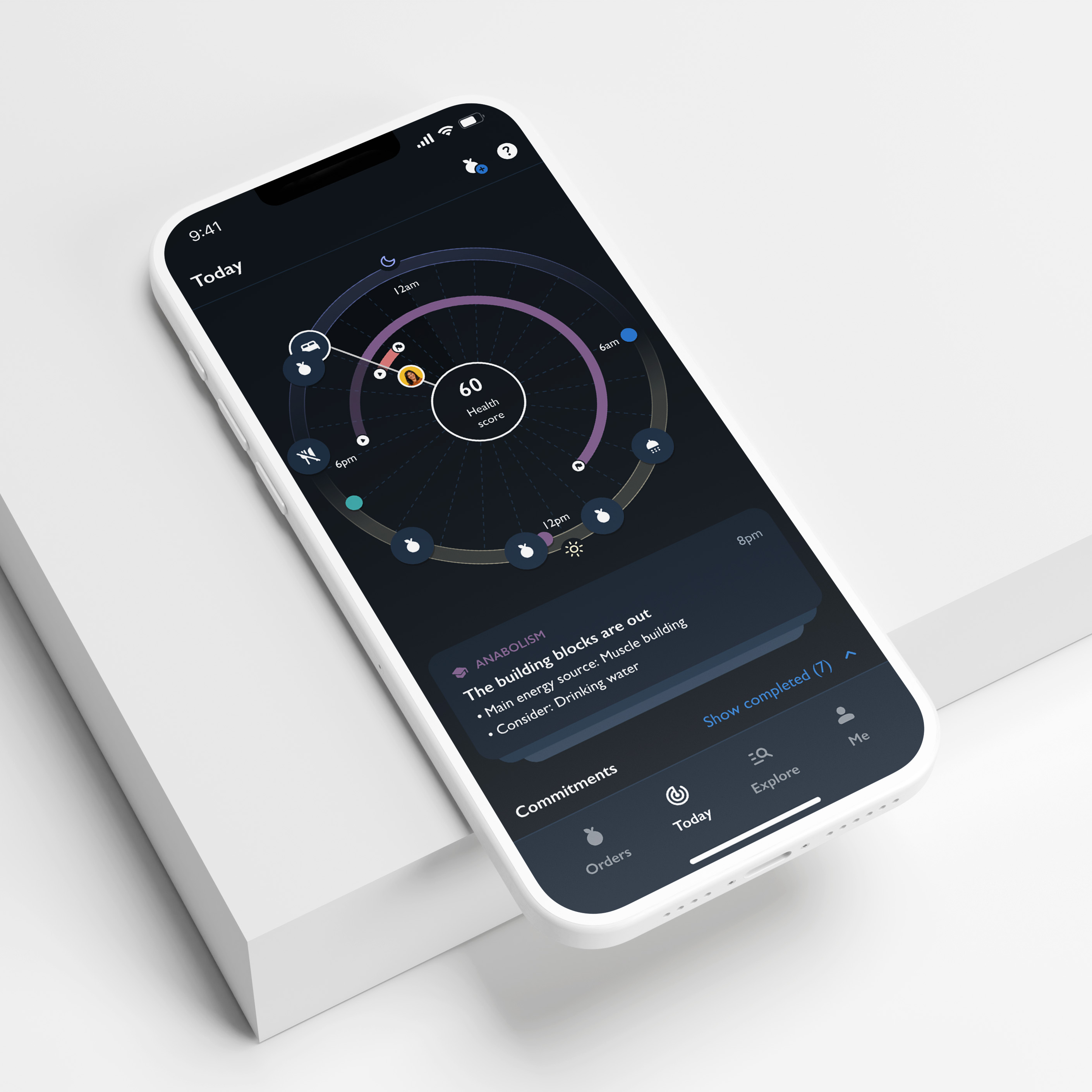
Coronation is one of the largest independent asset managers in South Africa. We were tasked with redesigning their digital investment platform.
While researching global competitor fintech platforms and the way their users interact with them, we identified some insightful patterns that steered our project:

In transitioning to a lighter feel, the information that used to fill the user’s screen needed to be intuitively presented and easily accessible. We achieved this by establishing a stronger hierarchy on each page. A combination of typography, colour, illustration, and spacing, translated into a thoughtful design system that actively helps users navigate the platform.


At the time, the majority of Coronation users only focused on a single product per portfolio. This meant that the portal layout needed to highlight the data for a single investment, and a larger portfolio. A common thread we found in our research was that international platforms consistently encouraged users to invest more. While we were creating a platform with a harmonious interface for people with single and multiple portfolios, providing opportunities for users to expand on their investments shaped the design process.
.png)
To allow users to access their investments regardless of what device they are using, we paid special attention to ensuring the designs could be scaled to multiple screen sizes.